Zine Creation
The Brief
The focus for this project was to create a fun and playful zine, inspired from a small copy of text. Throughout this journey we were to create and explore masthead designs, cover designs and spread designs all to feature within our zine. To accompany this, we had weekly workshops where we were encouraged to be experimental and expressive with different medias, and to consider whether to use these practises in our designs or not. Overall, the goal was to be creative, expressive and see what ‘happy accidents’ could help us create our zine.
Copy Text
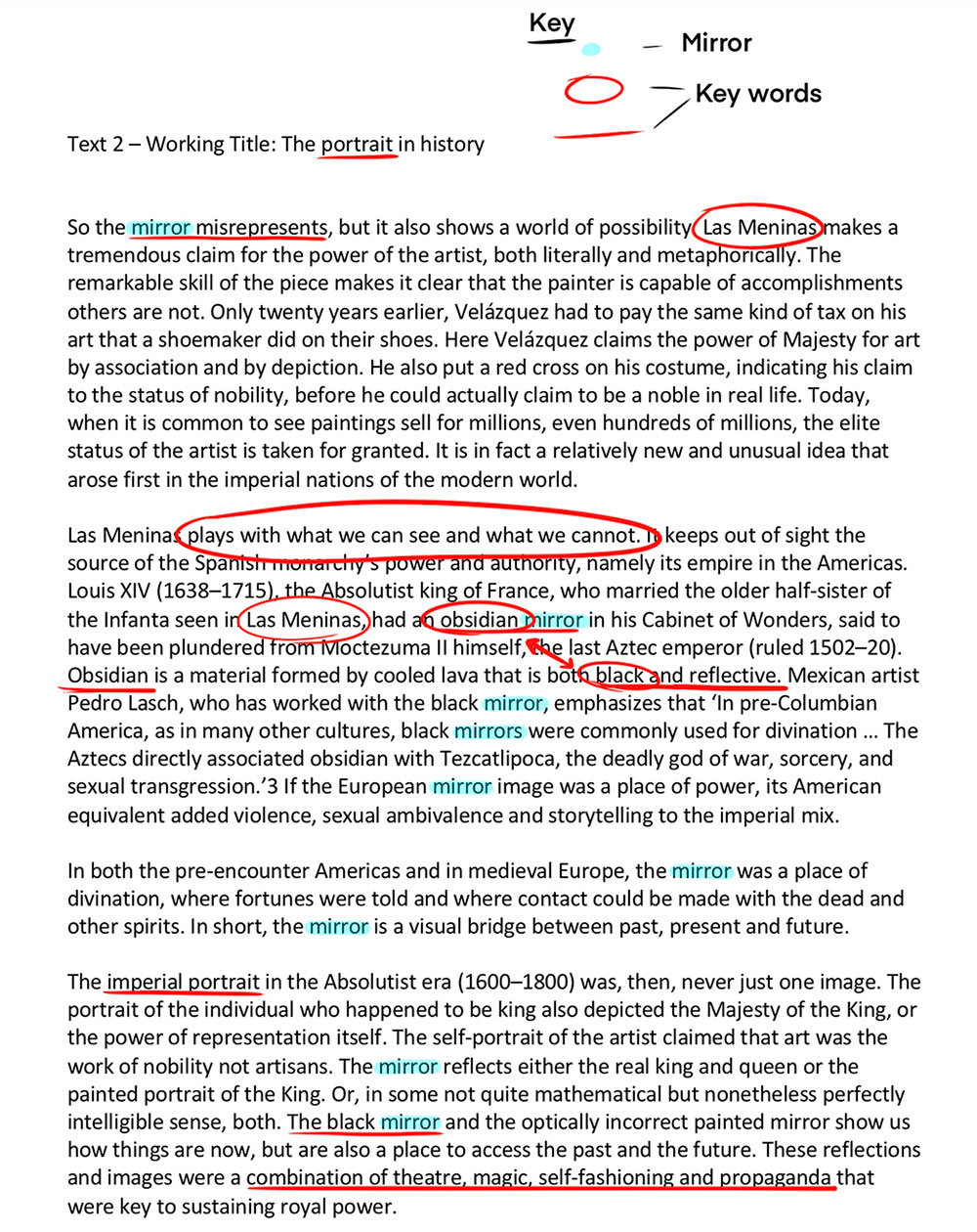
As I said we were initially given a small copy text to use as inspiration for our designs. Mine was called ‘The portrait in history’ and related to paintings, one of which was ‘Las Meninas’. The painting, from 1656 by Diego Velazquez, is believed to raise questions about illusion and reality and creates an uncomfortable relationship between the viewer and the figures depicted.
My copy described how it plays with what we can see and what we cannot. One key aspect of the text I took inspiration from was the mention of a ‘black mirror’, which inspired my broken glass cover and spreads, as a broken mirror plays with what we can see. As well as that it linked to portraits too, one of which being Marie Antoinette, so I saw this as key inspiration for myself.
Masthead Design
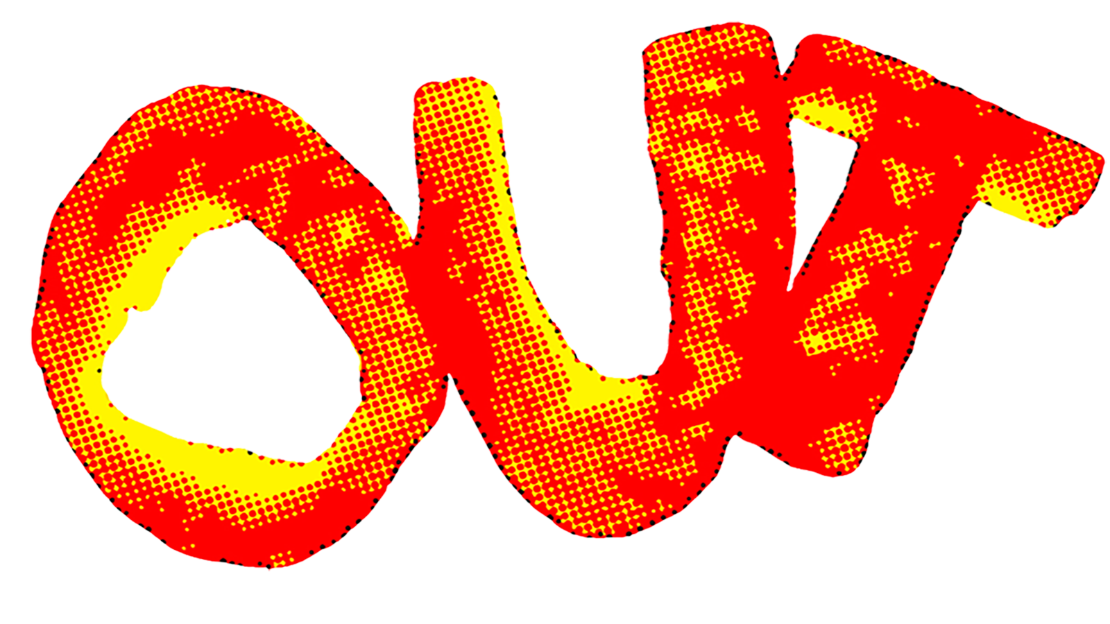
Our first task before creating any spreads or covers, was to establish a masthead for our Zine. Now the names of our zines weren’t picked by ourselves, we were given them randomly and mine was ‘Out’. I started by thinking what I could cut out of to create my masthead, linking my zine name to my creative process quite literally. I played with a range of medias, and surprisingly in the end I used an orange peel and cut the letters out to form my masthead shape. I then played around with it in both Photoshop and Illustrator, using effects and image adjustments to give a texture and style to my masthead design.
My Angle
I wanted to create a strong link to my copy text within my zine, and I felt the best way to do this was through my designs and experimentation. My text described how a painting played with what we can see and what we cannot so my angle was to make some of my design spreads distorted, with page rips, shattered glass and playing around with typography to extreme levels.
Cover Designs
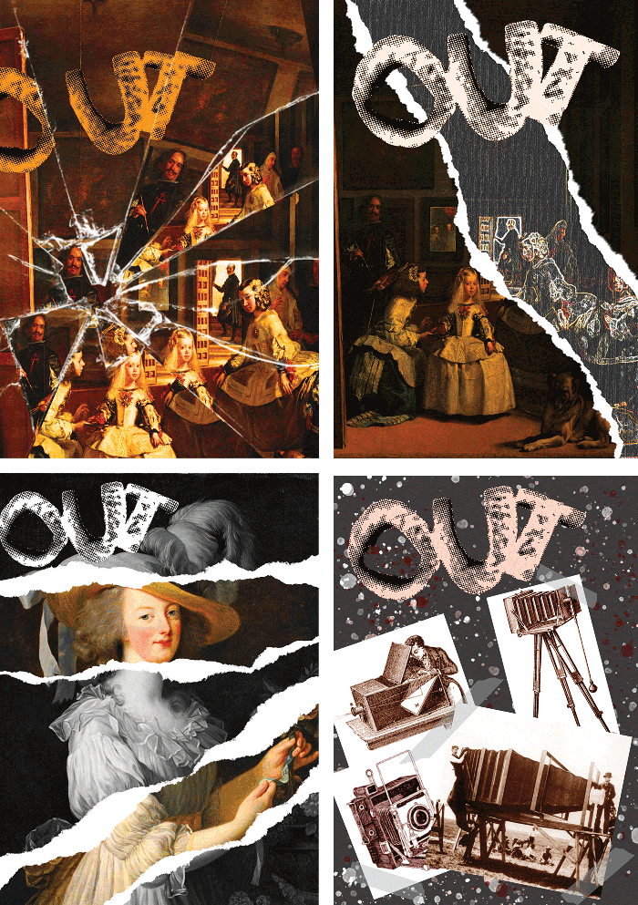
Once I had established my masthead for the zine, I then started experimenting with cover designs and styles. I wanted my cover to link directly to the copy text I had at hand, and so I started by using key imagery like the ‘Las Meninas’ painting and the portrait of Marie Antoinette to see what sort of styles I could create.
The key aspect I set out to achieve for my cover was having a design that you would have to look at multiple times as something new would be noticeable each time, lending itself to how ‘Las Meninas’ plays with what we can see.
A range of my covers can be seen here, with all of them playing with distortion and altering the famous paintings to hide certain elements.
Page Thumbnails
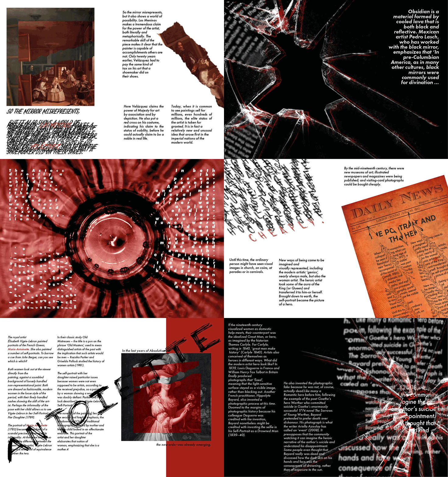
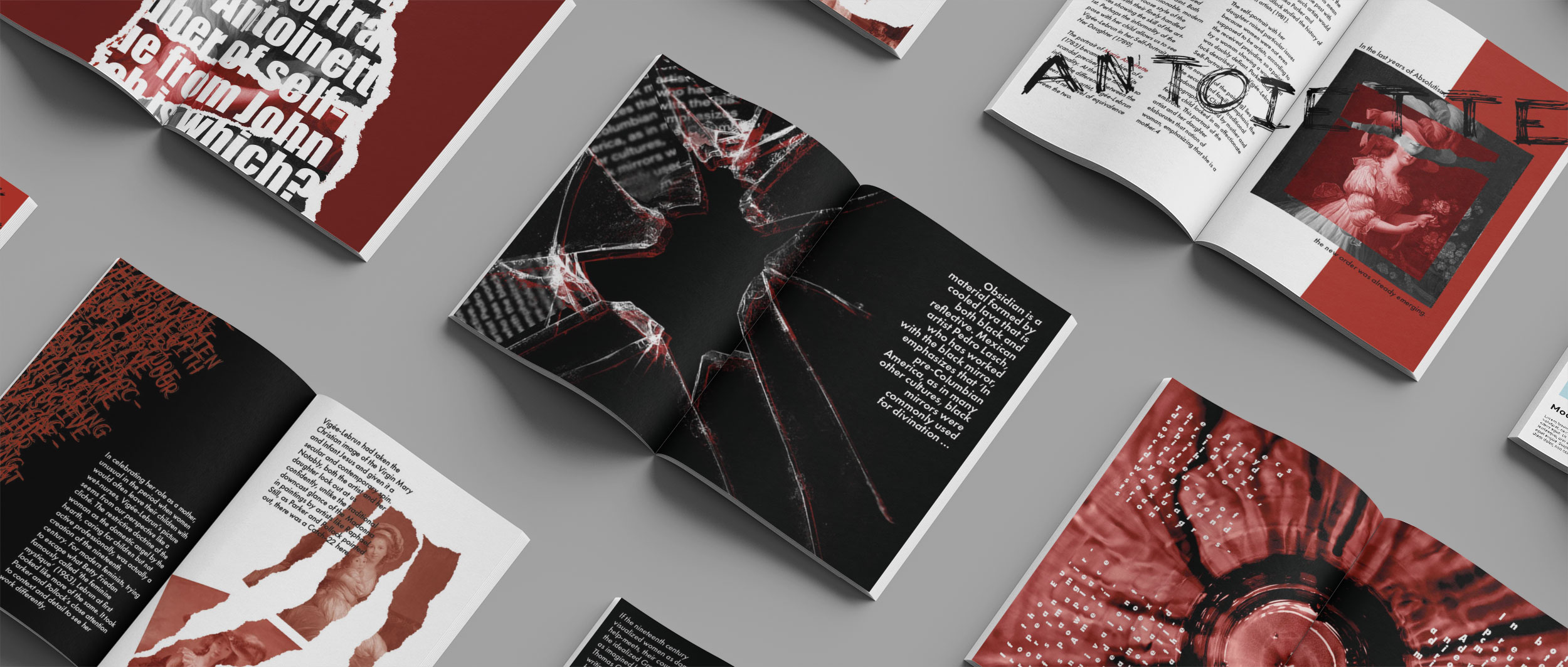
Here are my complete zine pages. Throughout my zine I wanted to explore a range of styles all whilst sticking to a solid colour scheme, so that it flowed fluently and still felt as one. By using a range of designs throughout my zine it was crucial that the pacing didn’t feel to unbalanced, and I believe that I managed to achieve a steady pace throughout and used experimental designs well with copy text to create a visual feast that plays with what we can see on the page and what we cannot.
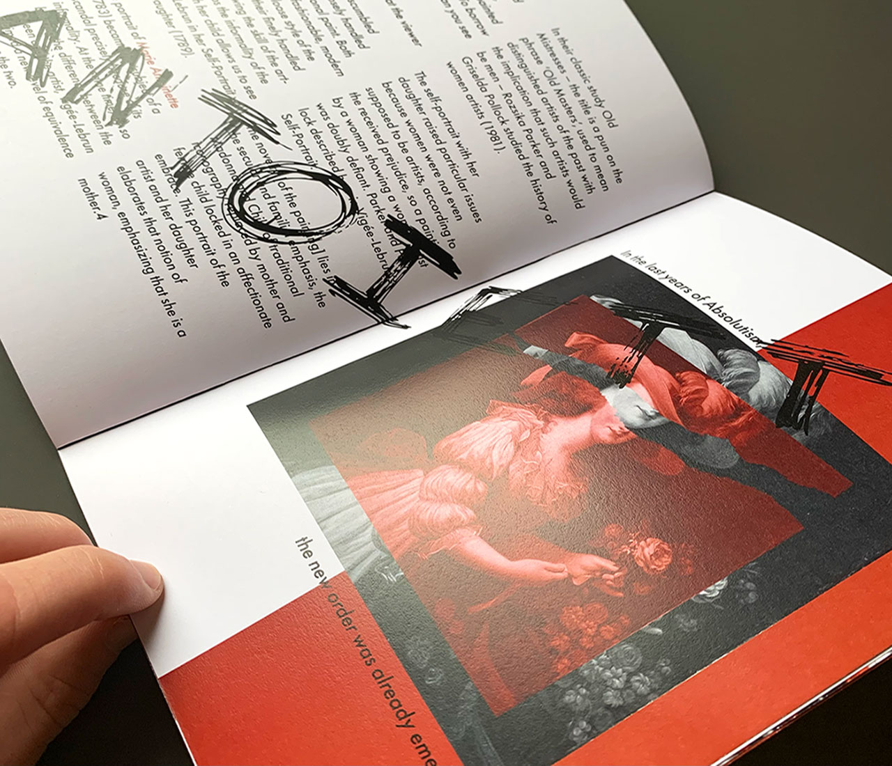
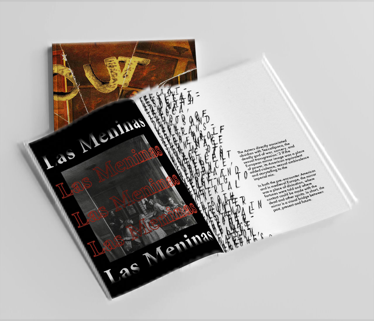
To the right you can see each individual spread of the zine shown through via this looping gif, and below are two mockups and a video of me opening my printed out version of my zine.
My Reflection
Overall, I really enjoyed the Zine creation, which was a first-year project at Arts University Bournemouth. It allowed me to explore a range of design styles and experiment with ideas and concepts I had be unaware of, or not brave enough to venture into yet and I feel that it really helped me grow as a designer. It allowed me to be more expressive with my work and create something that I am proud of, and that I feel shows another side of my design skills and capabilities.