Hardy Branding and Process Book
The Brief
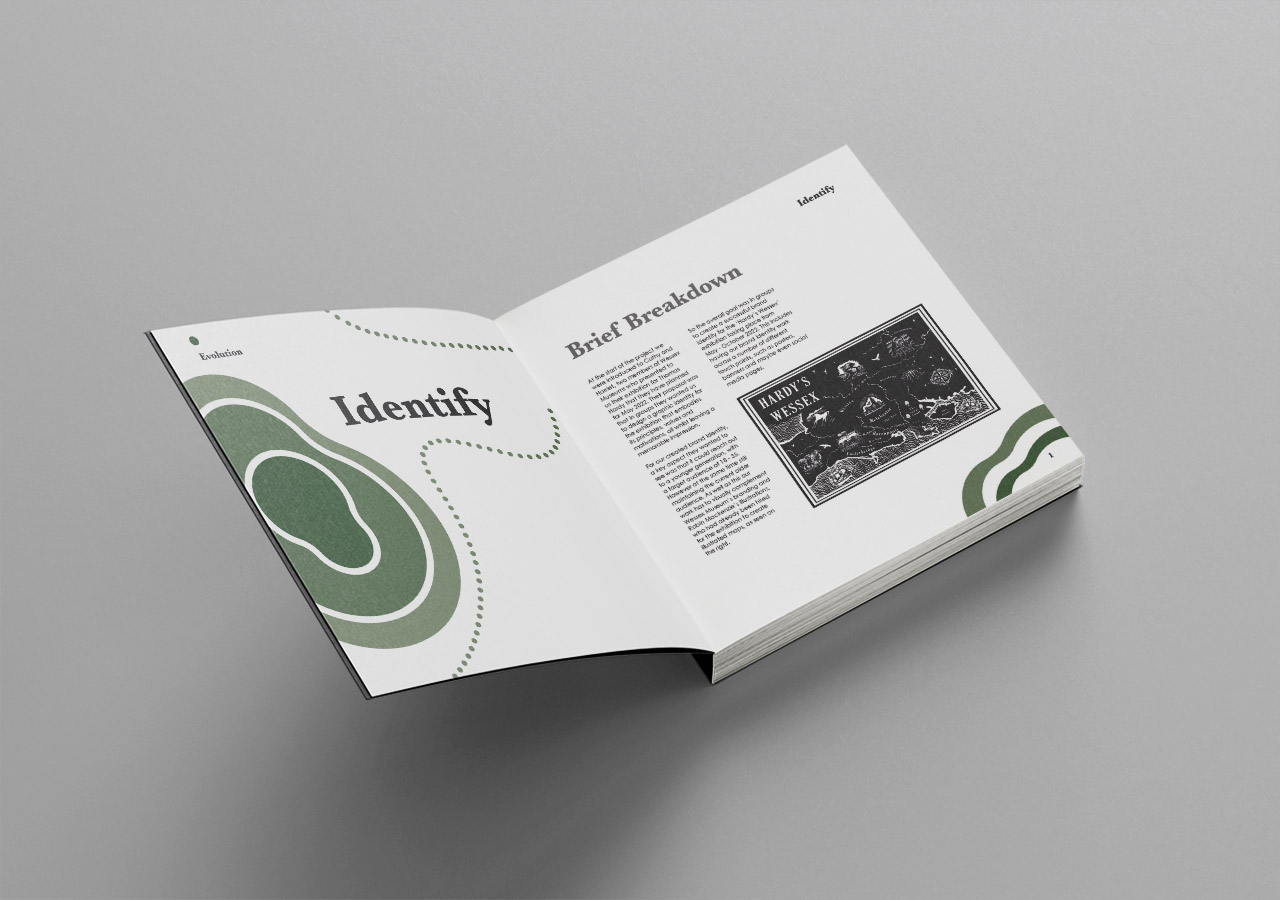
So, for this project there was two key outcomes I had to produce. The first was to create branding for a Thomas Hardy exhibition, hosted at local Wessex Museum sites in Dorset. This was a live brief with client interaction, critiques and was rounded off with an official pitch. I have since taken on feedback from the pitch and reworked some of the designs.
The second element was to then create and design a process book documenting and communicating our journey through the design process for the branding within our teams. As well as that we also had to document our process of designing the process book itself, showing our experiments with grids, type, layout and structure.
Research
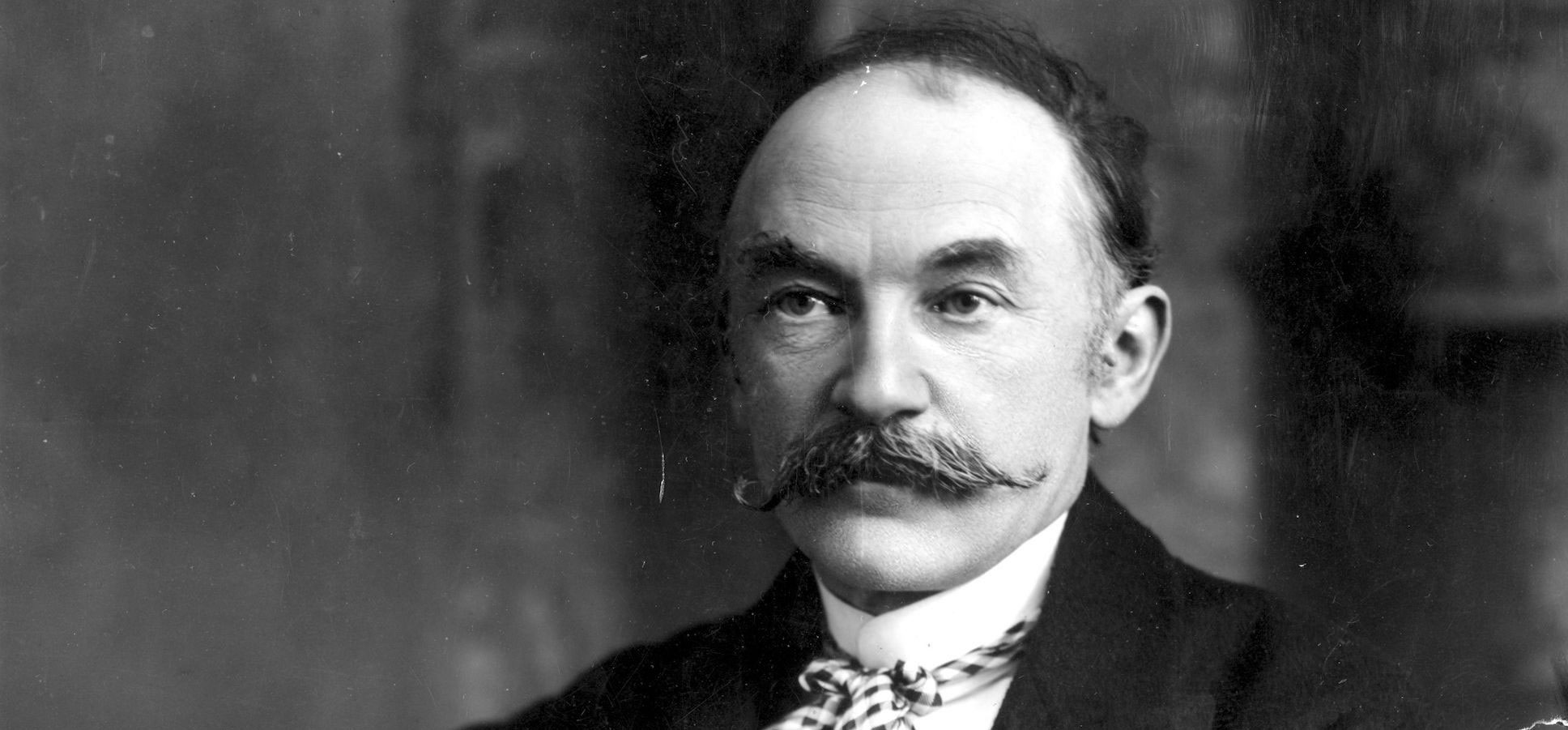
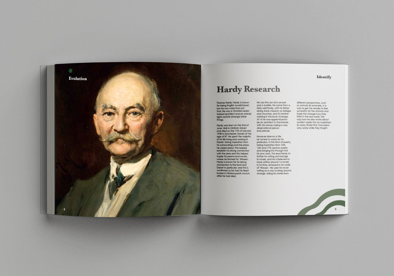
Starting with the Hardy Branding project, we were encouraged to research into Thomas Hardy and his world of Wessex, as the exhibition was focusing on the landscapes that the writer used as his everyday inspiration. I found that I was more focused on Wessex, and more specifically focusing on the old maps, as I felt there was strong visual elements that could be used within the designs and overall branding.
Brand Introduction
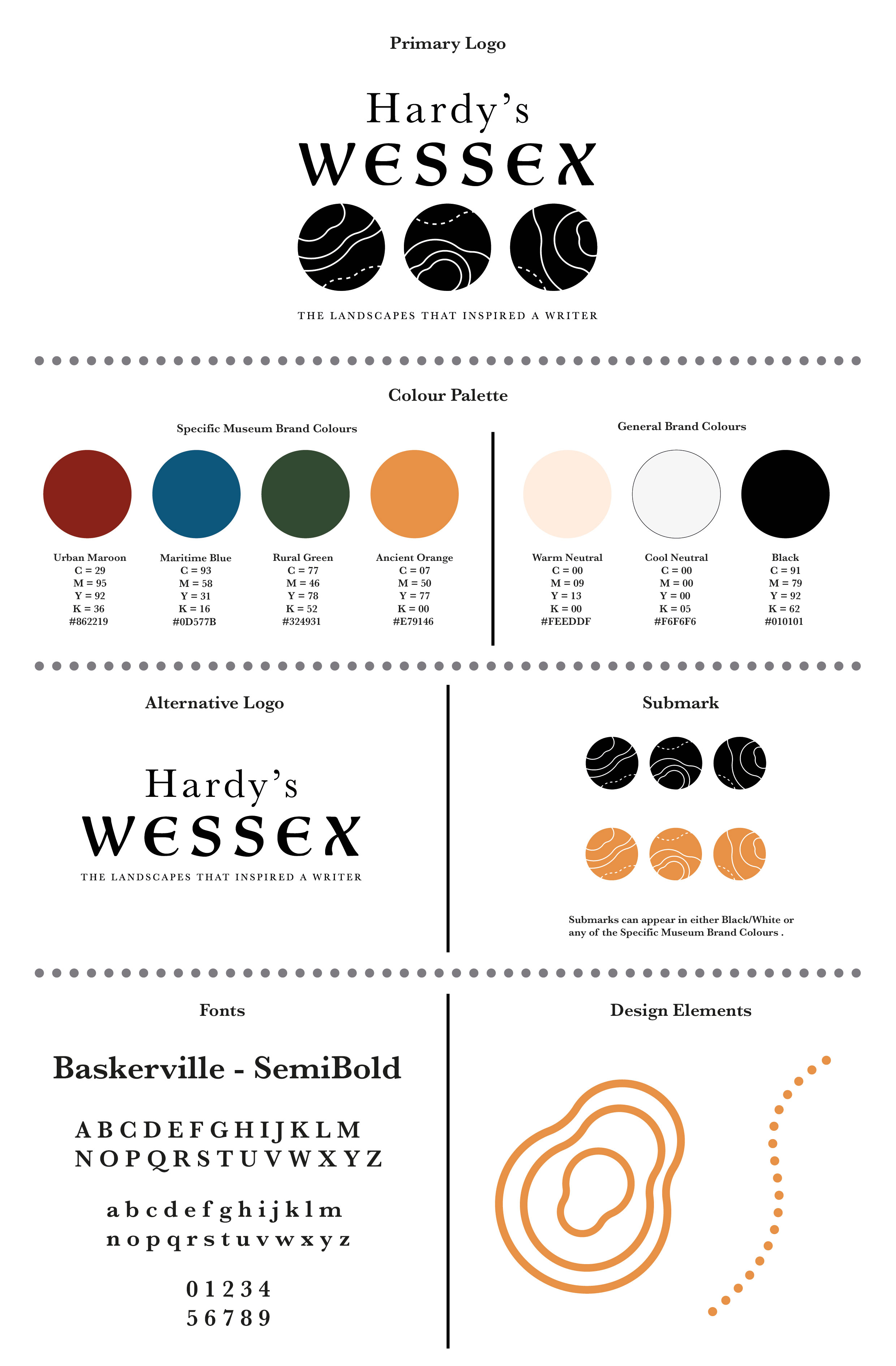
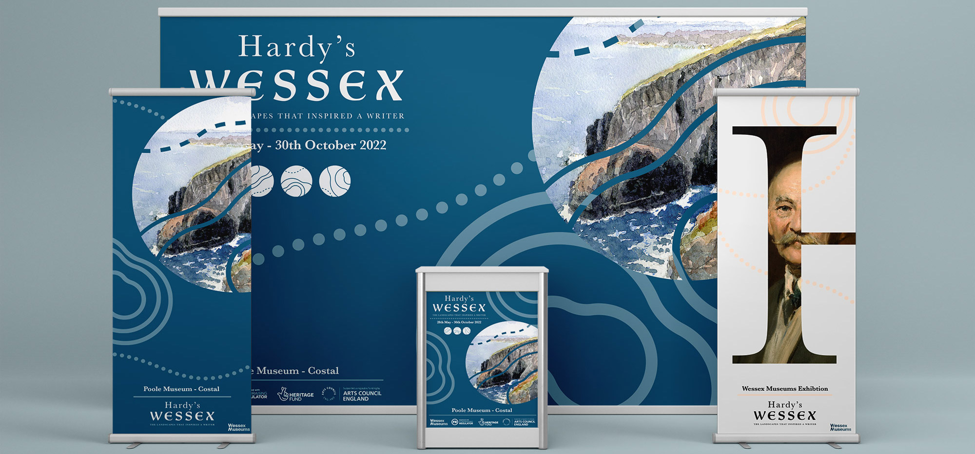
Introducing the brand itself, I have created a brand board to showcase exactly how elements such as the logo and logo marks should appear and be used.
Starting with the logo as seen at the top, the typeface is inspired by Hardys era and how more traditional styles of type were common. As well as the type the ellipsis mark that sits below has contour lines through each, and this is a popular submark that appears often throughout the brand designs, as this was personally requested by the client in a critique. The brand colours and font are introduced as well so that all key elements attached to the brand are on show here.
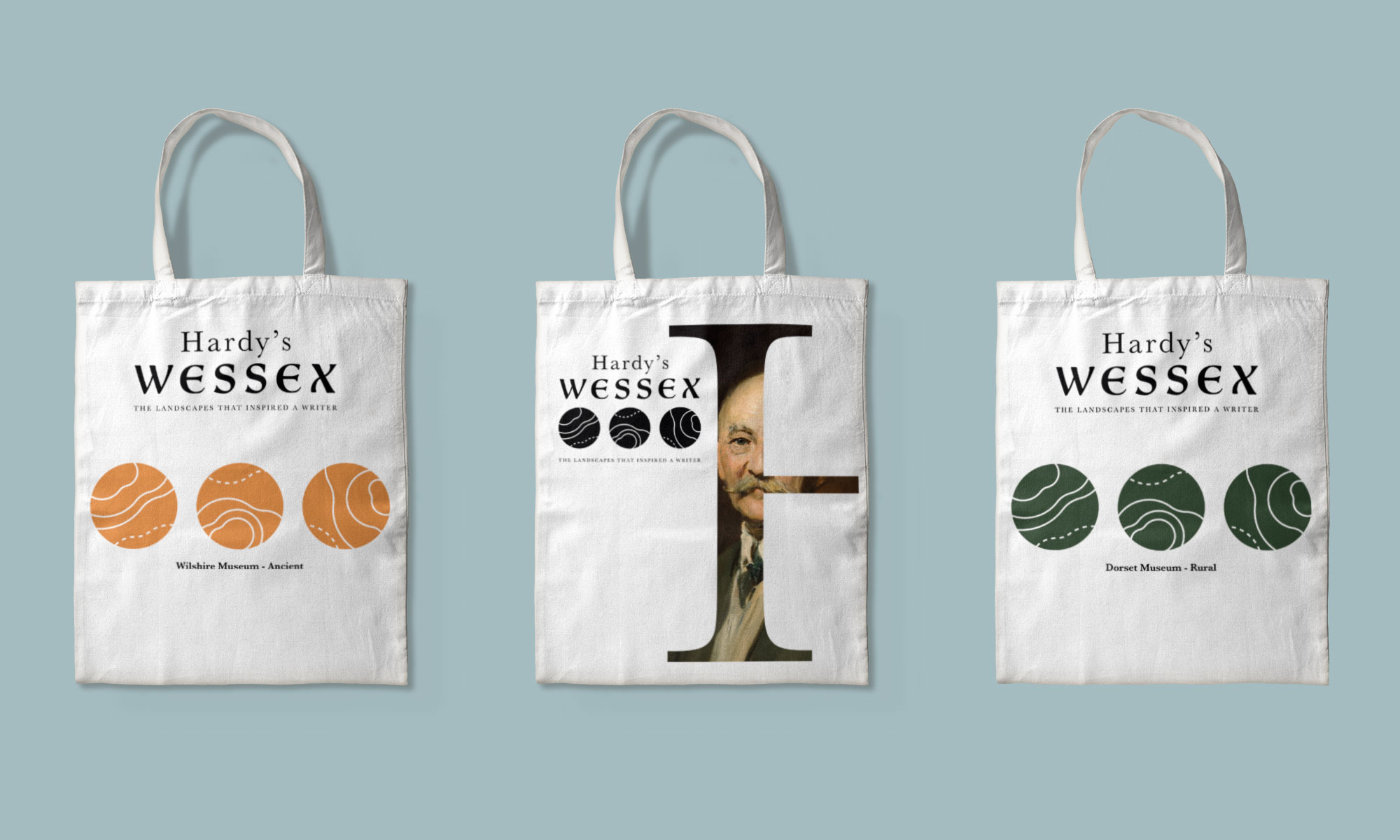
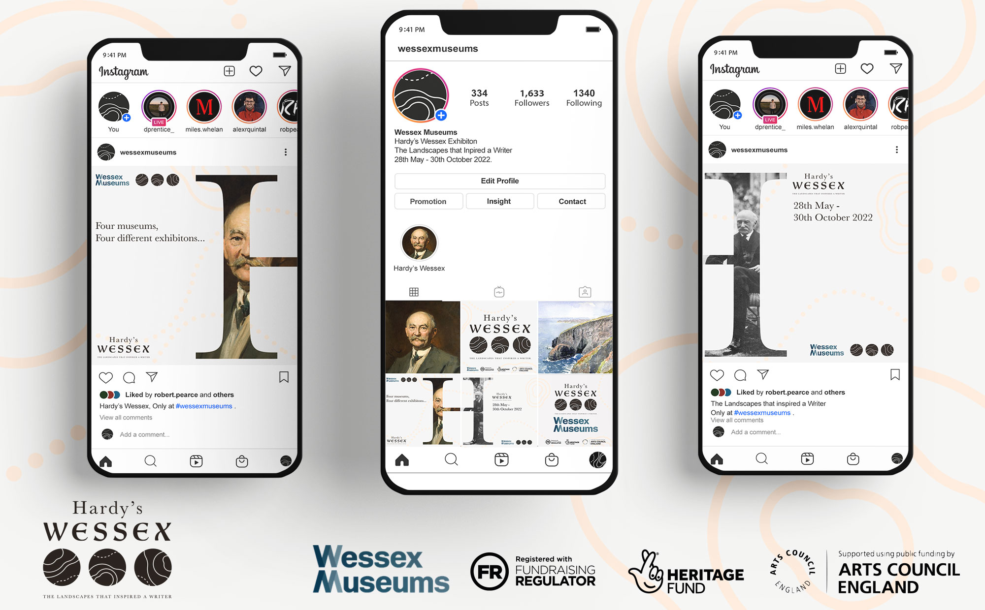
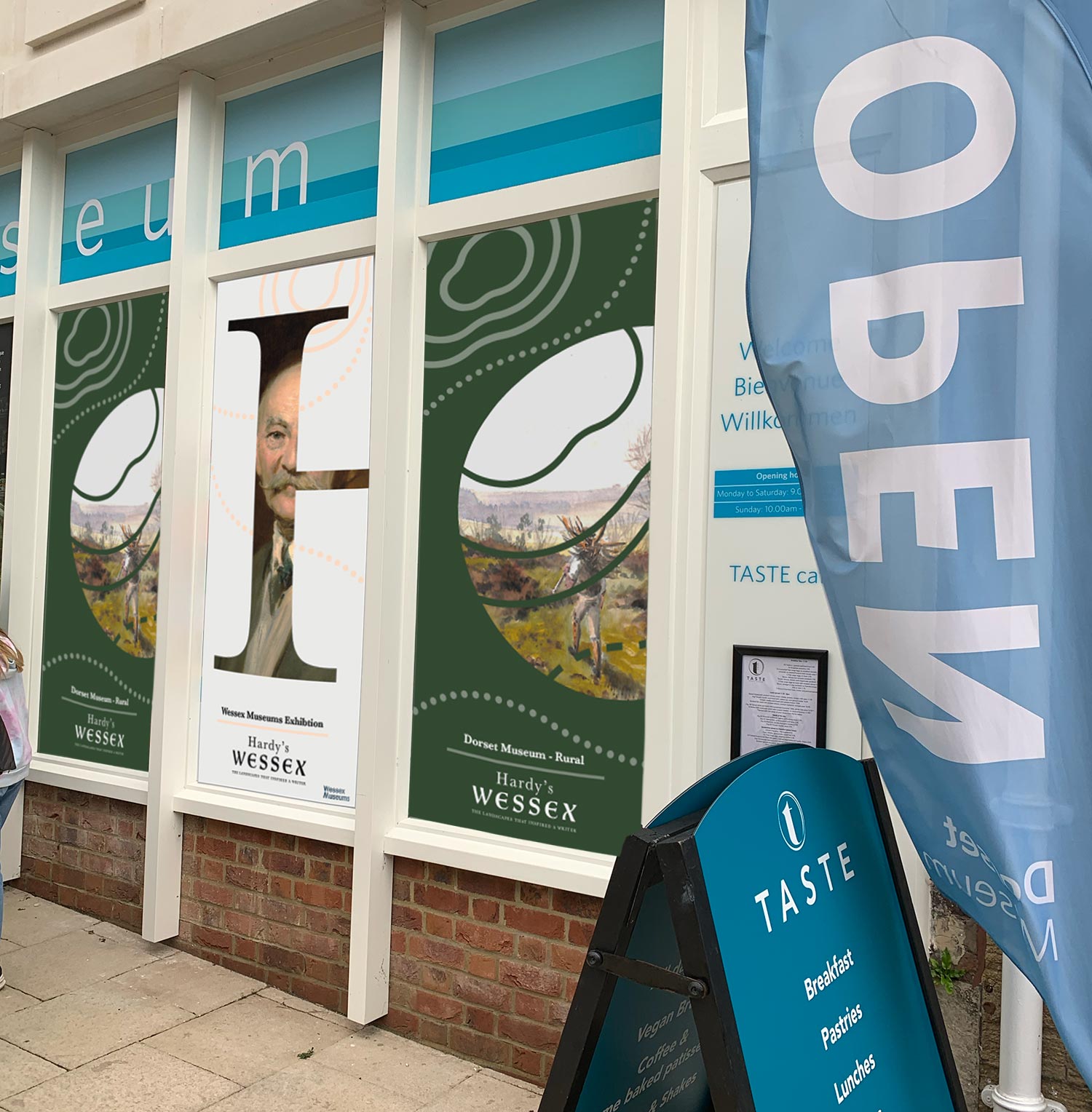
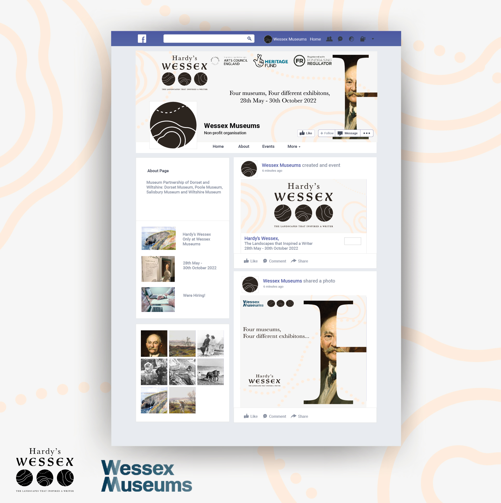
Brand Elements and Designs
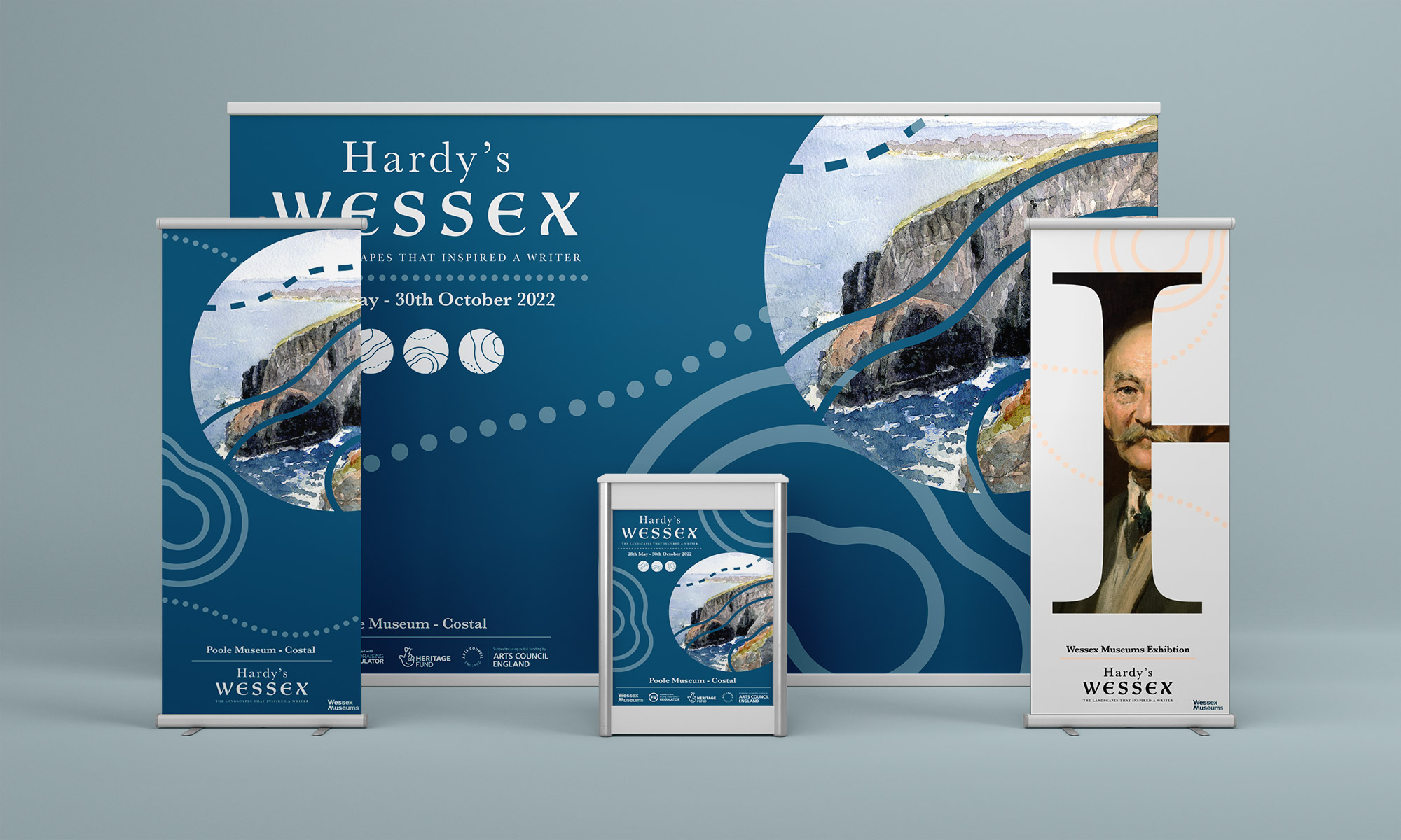
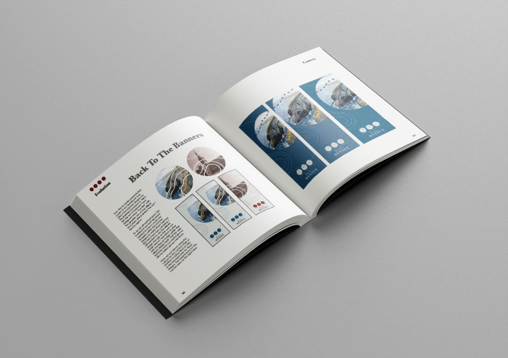
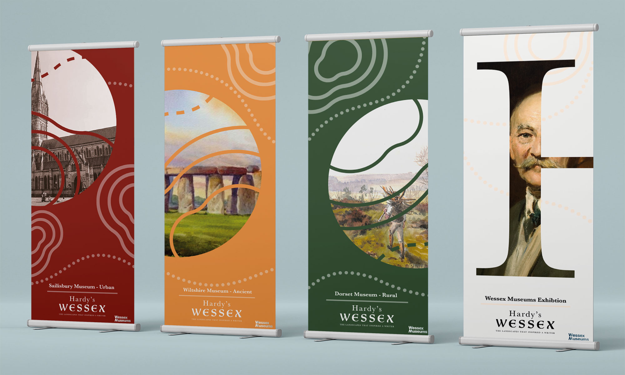
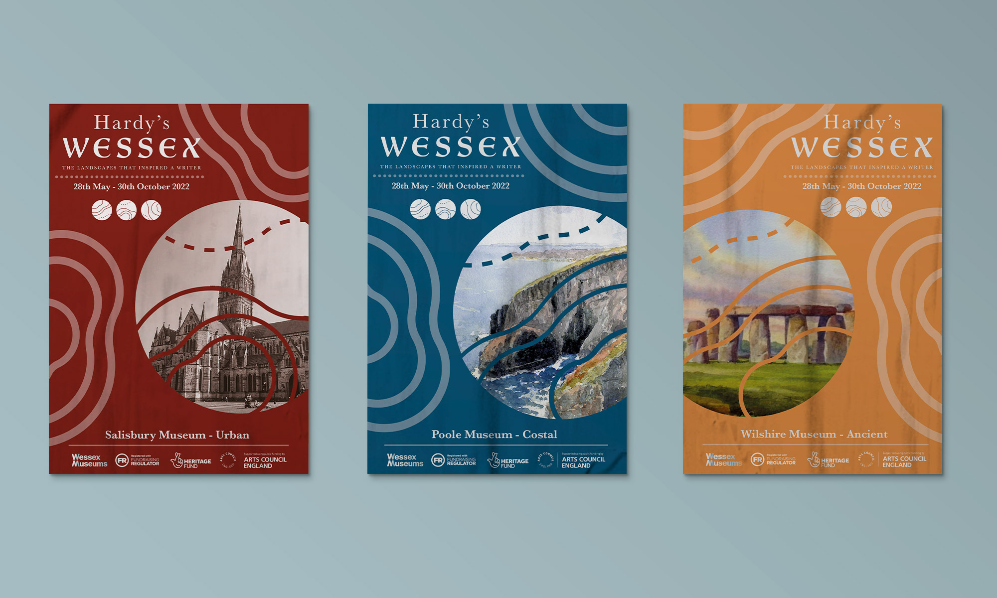
Here we have some of the brand elements that I have designed, with printed promotional material such as posters and banners. These would appear both inside and outside promoting the exhibition as well as the museum, with each of the four locations having their own specific colour for a range of the posters/banners as well as the neutral theme that will represent every site.
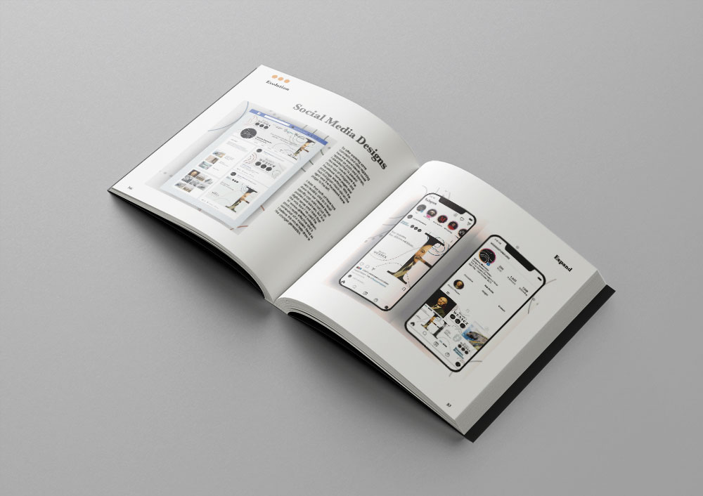
I also included Instagram and Facebook pages, as I felt having a social media presence is a big part of today’s brands and appeals to a broader audience who may not see the physical branding material, as this was an objective set by Wessex Museums.
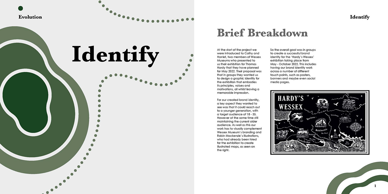
Onto the Process Book
Once the Hardy Branding was completed and pitched to Wessex Museums the attention turned to the Process Book. This was an individual task which as I said earlier was to document our process throughout the Hardy branding project. As well as this the process book also had document the creation of the book itself.
Colour and Type Styles
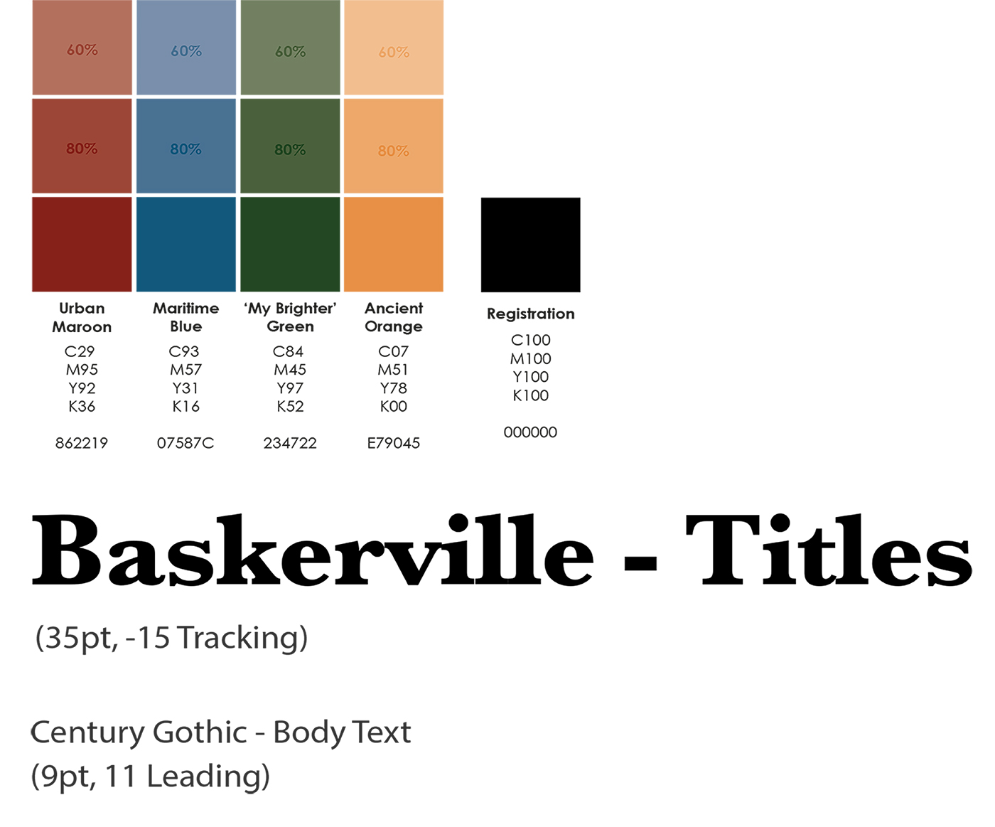
Here on the right, you can see the colours and type styles that I’ve used for my process book. This was a key element to the overall styling of the book as I used colour as an indicator, with each colour being the focus for one of the five chapters. I used tints of the colours mainly however as I did not want the design and style of the book to draw to heavily away from the content that I was placing within it, as of course this was what was being marked.
The colours came from the branding project as I had used four colours to represent the four museums that the exhibition would be held across. But as I said I didn’t use the 100% tints of these colours and instead used more of the 80% and 60% ones you can see here. Moving away from colours I used Baskerville as my font style, which was also from the branding. I found that using the branding style to inspire my books style, allowed the style to not be to overwhelming and I felt it fitted well with the content.
Construction and Layout
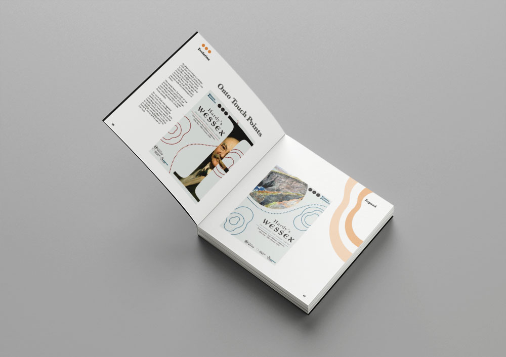
The construction and layout of my process book was a balancing act that I did not get right at first and had to learn as I designed the book, however in the end I felt I found a balance and that is reflected in the finished outcome. As this was a process book it was crucial that the content took centre stage and was the focus of each page. But alongside that the book itself needed to carry a clear and consistent design style that worked with the content I was including. Therefore, I used the same colours and fonts from our branding, and only altered them sightly with regards to the colours because I knew that at least this would allow it all to sit together well.
For the layout of the content itself I used a simple grid that I applied and followed on each page. I also had a hang line for all the titles to sit upon and nothing else content wise would pass this unless it was necessary. This allowed me to have space in the corners, which I used to host my design style for the book itself as this wouldn’t interrupt the flow of the content. One of my final spreads can be seen here.
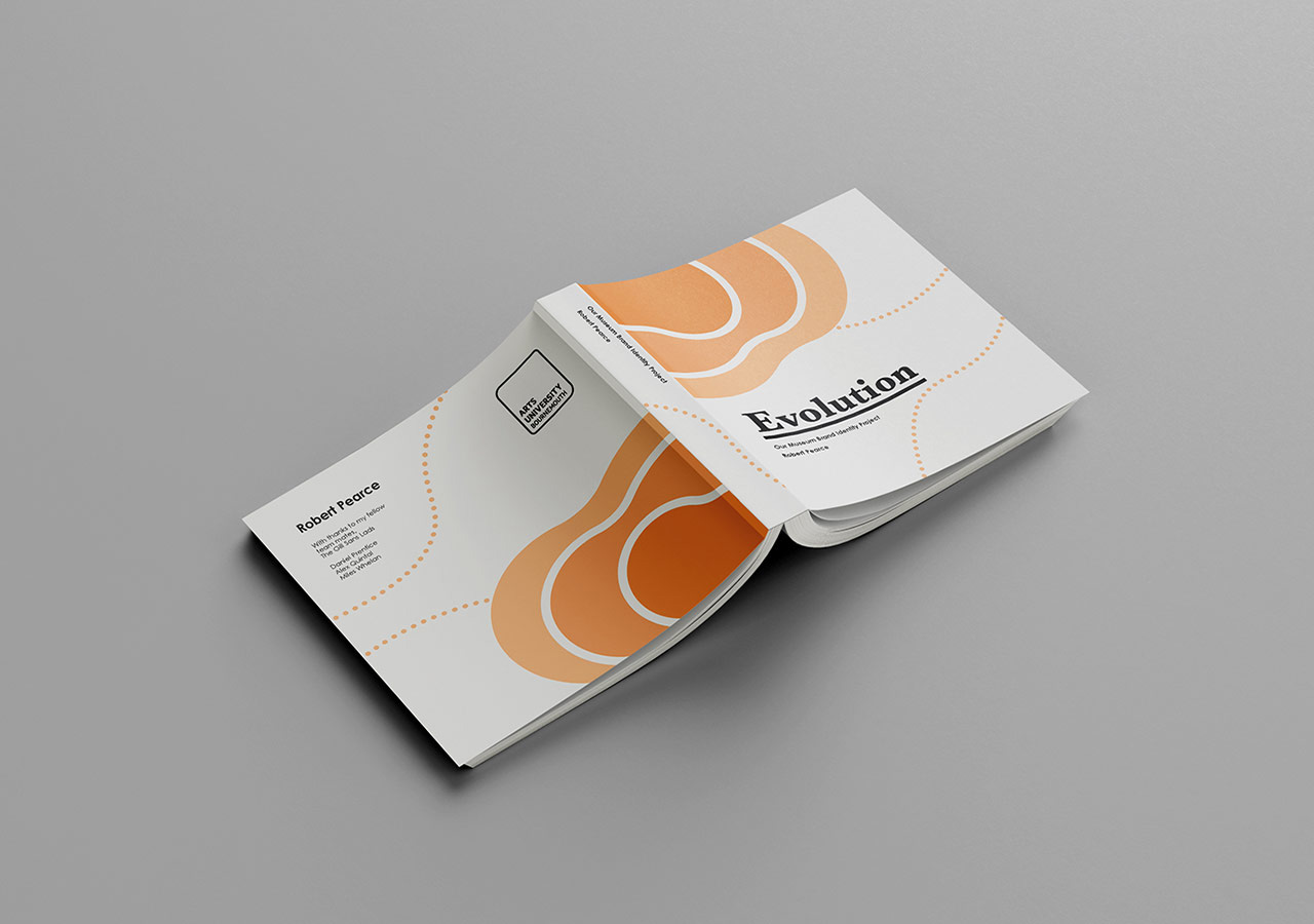
The Process Book
Here is a Mockup of my final Process Book, with the front and back cover as well as some spread pages.