Website Construction
The Challenge
To design and construct a website that can act as an online portfolio presenting our personal creative work and projects, with the construction being in the form coding, using HTML and CSS.
Website Structure Workshop
One of the first steps we had to take to be able to build our own website was understanding how a website is structed. This included the hierarchy of pages, with the home page always being the main page for example. In the studio our task was to pick a design agencies website and see if we could break down the structure of it. In my small group we chose to breakdown Templo’s website, as seen in the image on the right here. I felt this was straightforward, but it brought to my attention how to go about structuring a website and what it includes.
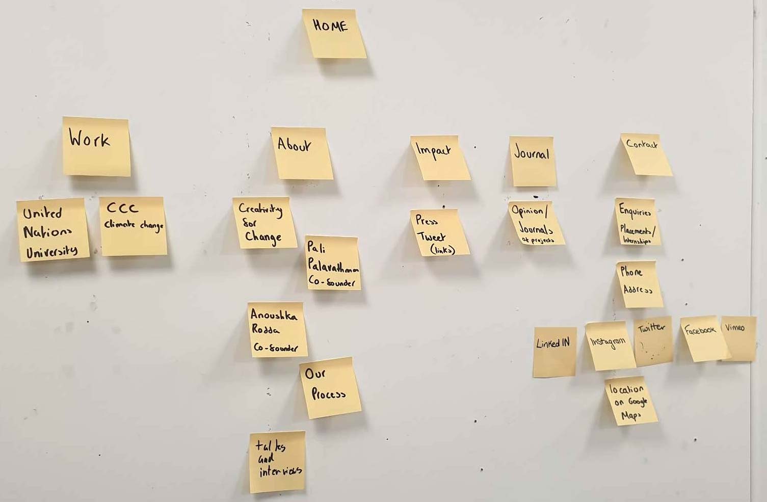
Navigation Planning
Following our website structure workshop, I then went away and considered how my website itself would be structured. Mark had already given us the intro, noting the home, projects, about and contact pages. However I wanted to plan further, for this I went onto Miro and started building the framework for my website and how each page may flow. Now this is not final as I continued to make changes as I built this website, it was just for more directional purposes to help myself structure and see how my website will be navigated. It was a relatively simple task but one I found very useful and proved to be a great help for myself.
It allowed to me to visualise how someone would scroll through the pages and this allowed me to determine which elements of the page would sit where. I think this combined with the workshop gave me a greater understanding of how websites are created and the process which takes place before anything is even coded.
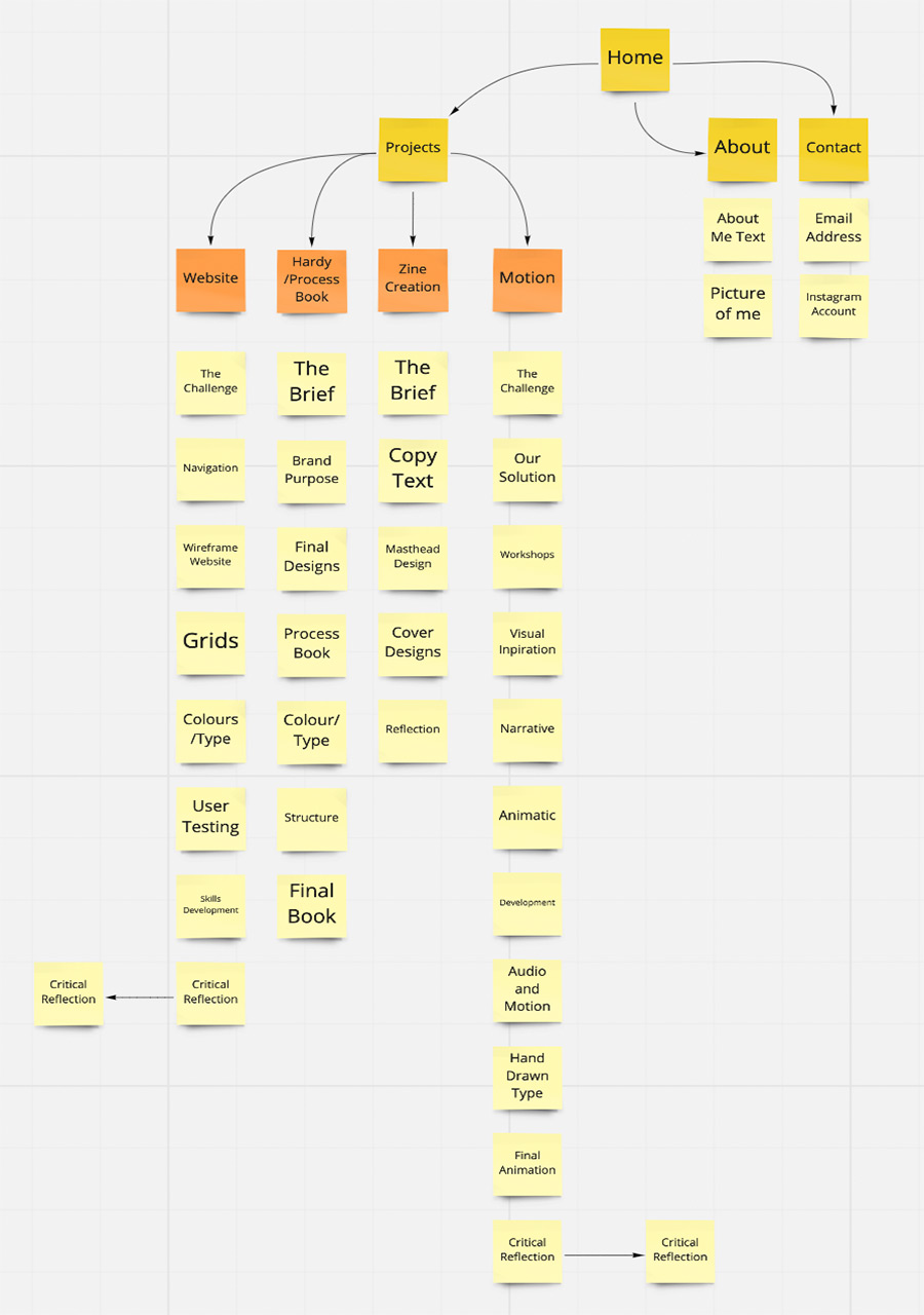
Wireframe Website
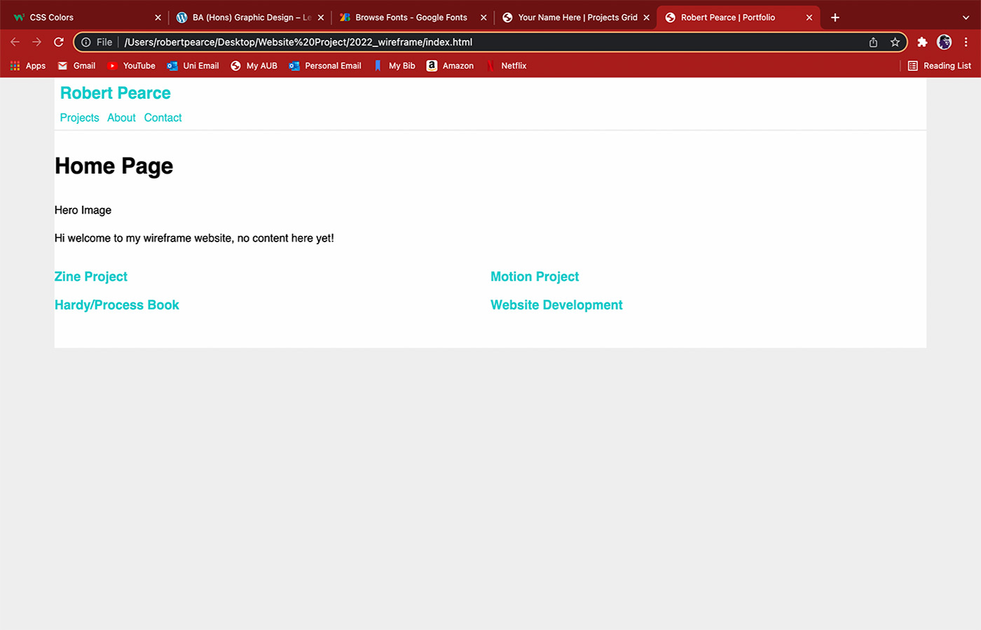
Now that structure and navigation were being considered the next step was to create a wireframe website. A wireframe is an empty website, with no content, it is purely created to show the structure of a website and how it can be navigated. It is essentially a blueprint for a website so that the builder can see where content will go and how it flows.
So naturally the next step was to have a wireframe myself, to see how I may choose to structure my website. For this mark gave us a template and we populated it with basic information, like titles for projects and our names. I also played around and shifted my projects into a row of two, to get a feel of how it may appear compared to the original amount of three, as I preferer the idea of two. Overall, this was a useful step and was my first real experience of having something that resembled a website.
Foundations In Place
Now that the structure of my website was beginning to be laid out, I turned my attention to styling with the idea of colours, fonts and how to layout my content.
Visual Inspiration
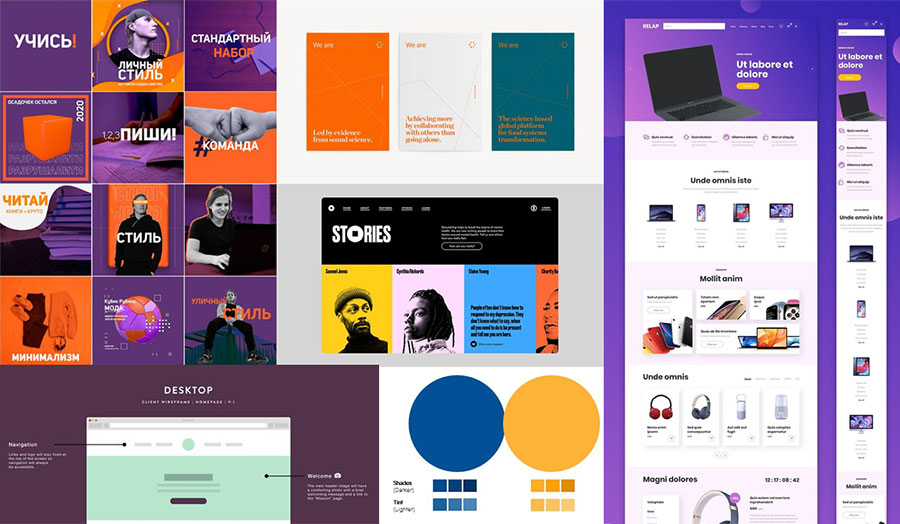
Before I began going headfirst into splashing colours and content into my website, I decided to look for some visual inspiration to give me some inspiration and a starting point for ideas. As you can see, I gathered a range of images with some for colour reasons and the others are considering layout, with there being a lot of oranges, blues and purples being the main colours as these happen to be a few of my favourites, I want my website to be personal to me, so I’ve looked for colours that connect to me.
Colours and Type
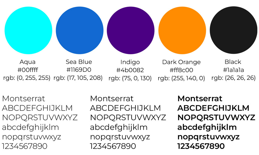
Another key element in building the website was the styling, this included colours and type. With regards to colours, I wanted to use only a select few that I personally resonate with and work well together, as well as compliment and sit well with my content. I feel the Aqua, Indigo and Sea Blue complement each other very well, and then the same for the Dark Orange and Black, which is a slightly lighter version than complete Black. The colours work well and sit alongside my content successfully. Orange has always been a favourite colour of mine as well as purple and aqua blues, so these connect to me personally.
As for the type, I used Montserrat as I feel it has lot of range with its weights which is why I choose to use it. It is a simple and bold font that is clear and easy to read with a range of different weights and sizes. I liked this as for my headings and navigation bar I can choose to have a bolder style and with text I can have a lighter style, all whilst retaining the shape of the font. It is available from Google fonts as well so it’s a web font that should work on most browsers.
Layout and Grids
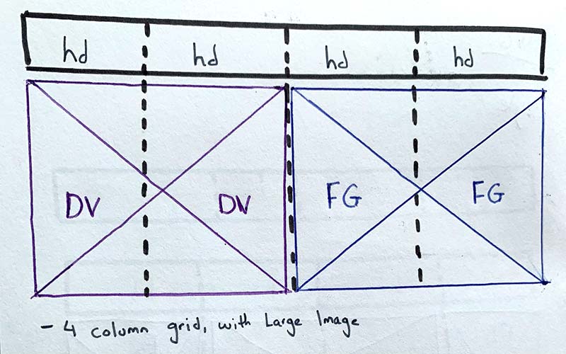
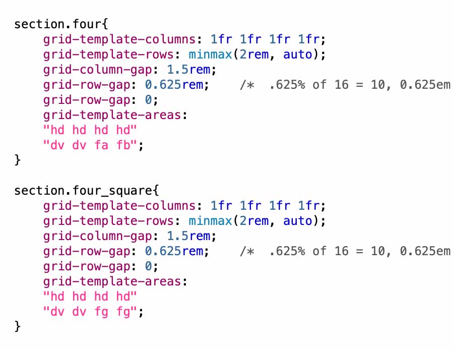
So now is when things began to become more specific and technical. I now have a rough plan for how my website will be navigated and what colours will be used, however the missing piece was how would I arrange my content. Mark gave some sessions on CSS grid, which is what we’ve been tasked to use to layout our content. This is by no means a fixed grid however, as there are many variations one could create. We started by using a three-column grid however once we were introduced to a four-column grid this quickly became my go to.
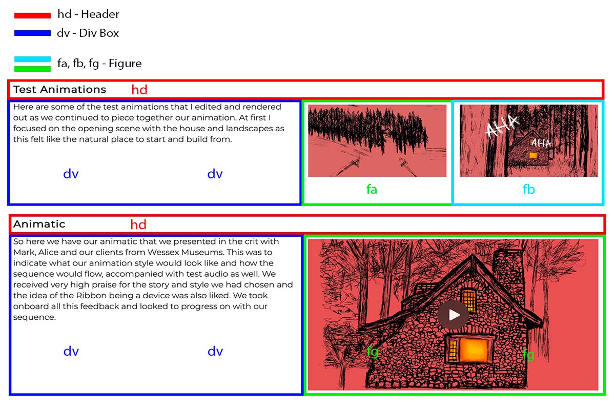
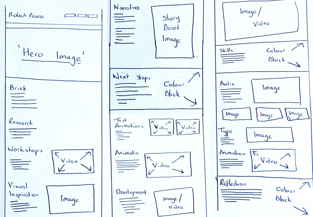
Before I started with the CSS however, I drew up some grid styles on paper and layouts of how my project pages may appear, these can be seen below, and I have a few more that you can view if you Click Here. I found that having a visual on paper to aim for helped a lot and gave me a sense of direction. On the right here you can see the CSS markup that I have used for some of my grids, with the real website example on the right here and the code just below. This is to show how my content sits within the grids I’ve made and how they help structure the layout of my website.
Adobe XD
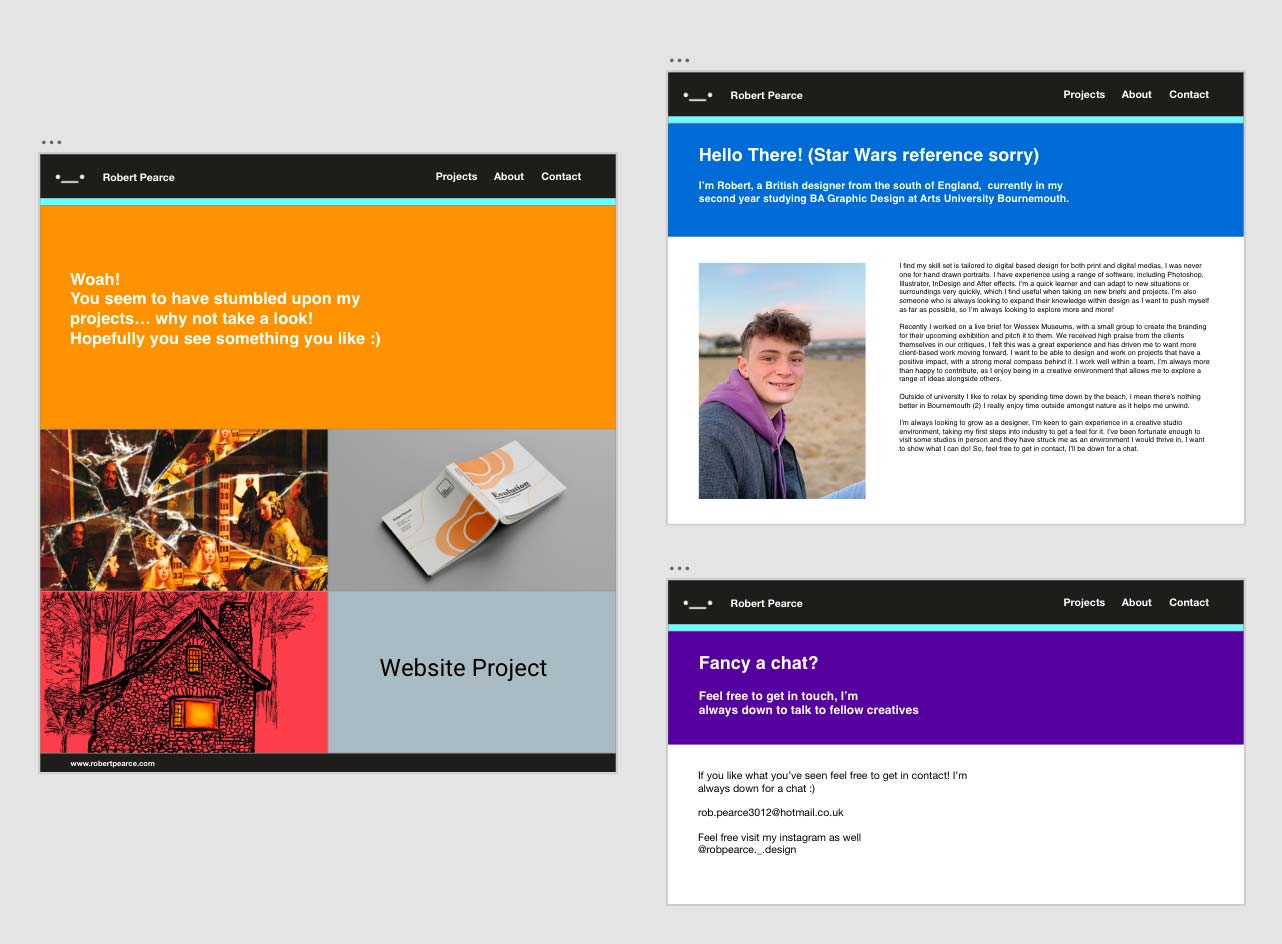
Once I had experimented with layouts and learnt about how CSS grid works, I quickly started to do a mock-up of my website in Adobe XD. This wasn’t something we were told to do however as I have previously stated I work better when having a visual of what I want something to look like. Adobe XD gave me this on a digital sense, combining my colours, layout and seeing how all this would come across on screen. Here you can see some screenshots of my XD file and see for yourself how it inspired the final product you find yourself scrolling through.
Styling and Design
As you could see on the XD file I used the colours, fonts, and grid/layouts to build a mock-up of how my website could work. I chose to use these blocks of colour as they flush out the colours I choose to use, and I feel that they also break up my content pages effectively and stop the pages from becoming over repetitive.
Bringing It All Together
I now have the structure and the styling both coming along, it was time to bring them together to form my website so I could begin to finalise this project.
Navigation In Action
I have decided to use my Instagram logo in my navigation bar on my home/projects page as my name appears on my landing image. But I have not extended this to my fellow pages as I think having my name was a clearer indication back to the home page.
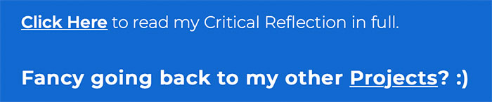
With regards to other elements when considering navigation, I also have links at the bottom of all my projects pages, so that the user can quickly fine their way back to the Home/Projects page. As well as this, on project pages where I have links to extra pages they can also be found very easily as all links in text are underlined.
User Testing
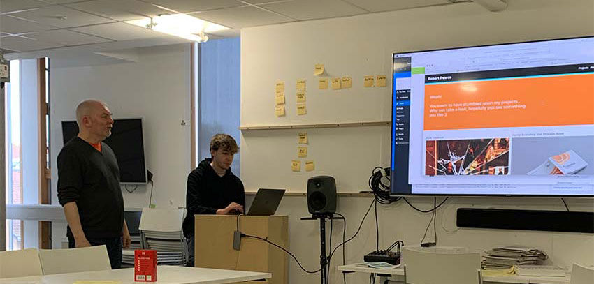
As websites are user-based platforms, I had a user testing crit in studio with fellow students where we each uploaded our websites to Netlify, and then went through them on the big screen and gave each other feedback, Mark was there as well to give his take and provide key tips and feedback. This was beneficial I felt as it gave my website a chance to be looked over with a fresh pair of eyes, for anyone to suggest improvements that maybe I wouldn’t have seen as I can appreciate that when it’s your project it’s easy to think its somewhat perfect.
From this I received very high praise, with Mark stating it is a “Very well put together website.” Everyone in the room also had good things to say which was obviously nice to hear. However, all cannot be perfect, and I did receive good feedback about certain elements I could improve, this wasn’t anything major but more to do with emphasis on certain parts of my content. Making sure images have captions was one that was pointed out, as captions provide greater context which in some cases is needed. But overall, the feedback was constructive and gave me confidence that I was along the right lines.
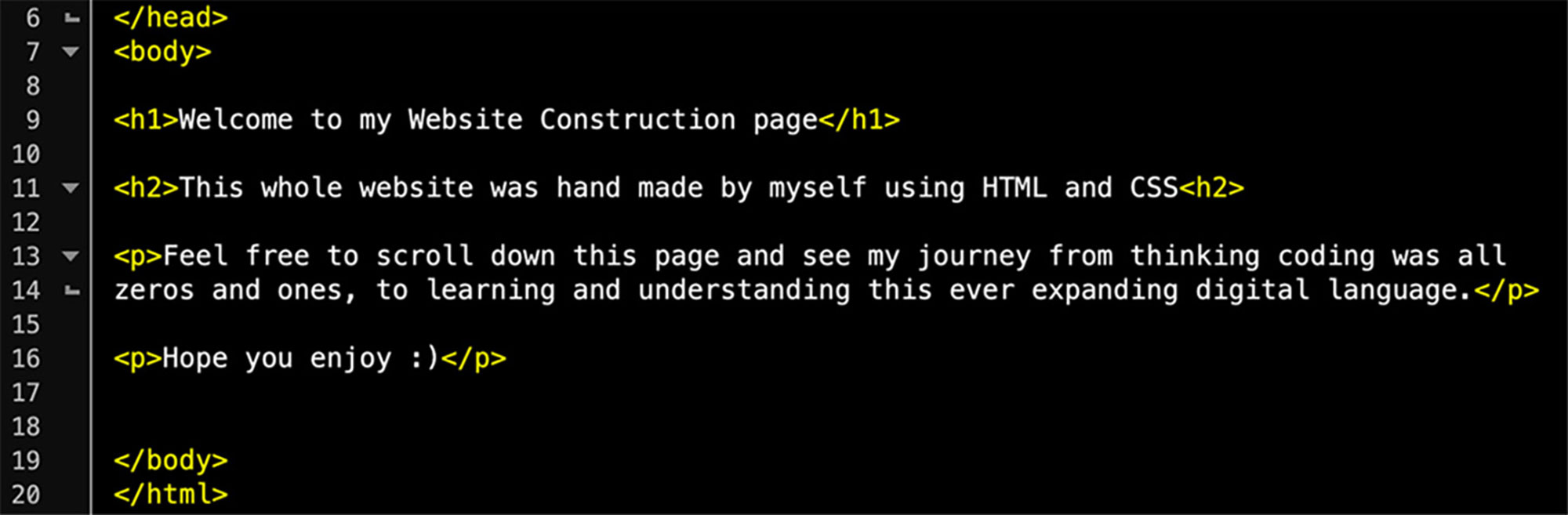
Leanring To Code
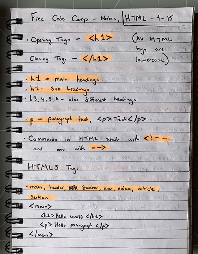
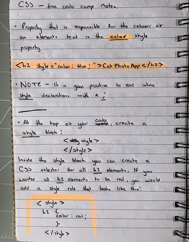
At the start of my journey with regards to this project I had little to no knowledge about coding, HTML or CSS. But thankfully for myself that quickly changed, as I took advantage of free code camp to teach me the basics of both HTML and CSS. Mark then did a series of sessions of which I attended each one and they all proved to be crucial. As I found myself starting to understand this new language, we were given a template for this website, which was a huge help, and I spent a long time reading and understand the code that had been put in place and what each part controlled. I found that having the template helped a lot as I learnt from the code, I had Infront of me and I used this to my advantage to further my skill development.
This enhanced my knowledge and made each step that bit easier and more comfortable for myself, and I looked to grow my knowledge by studying existing websites, and resources like W3schools. Overall, I would say my skills in relation to coding have really developed and I can say for sure that I know much more now than I did before, with the proof being the website right here.
The Final Thing
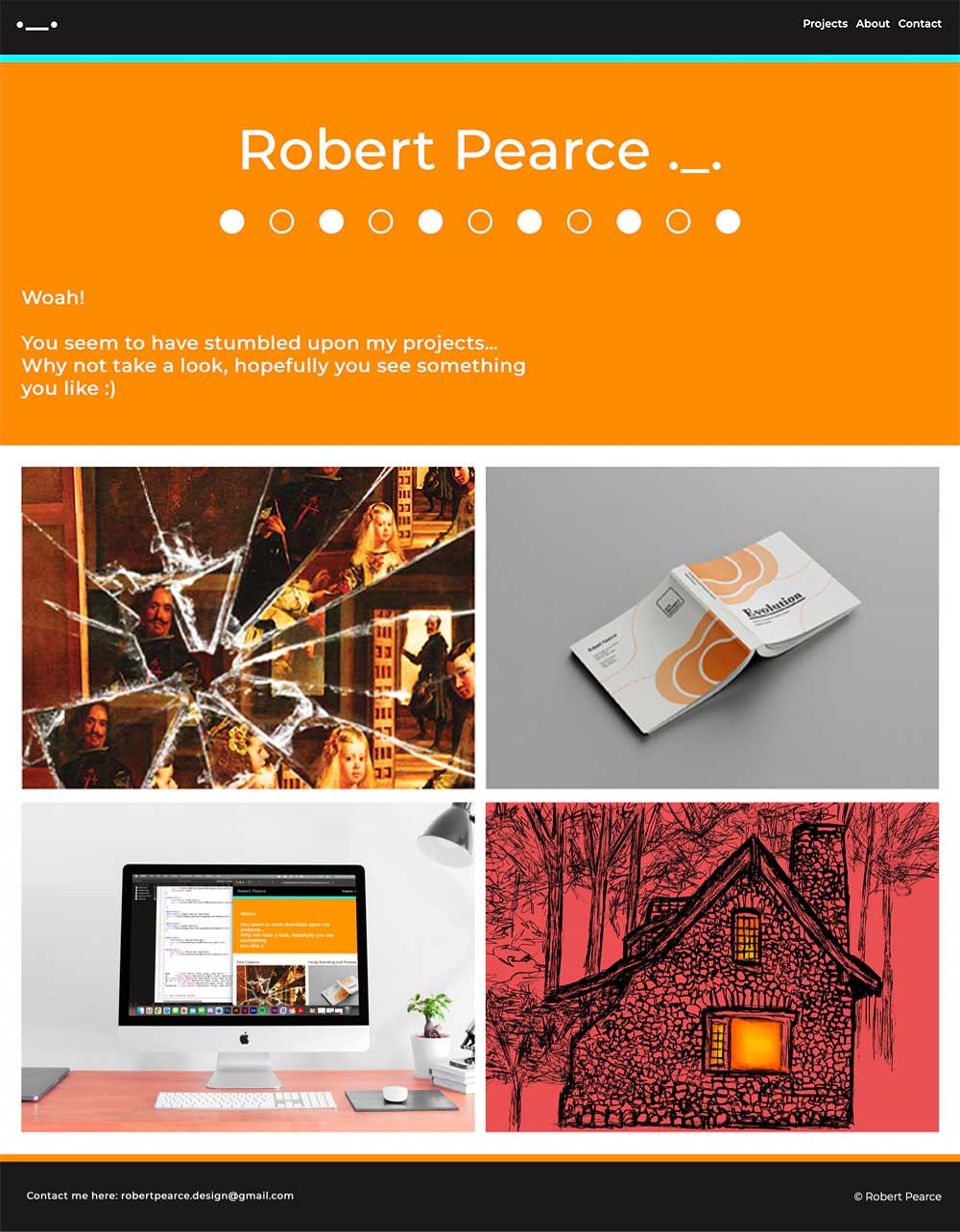
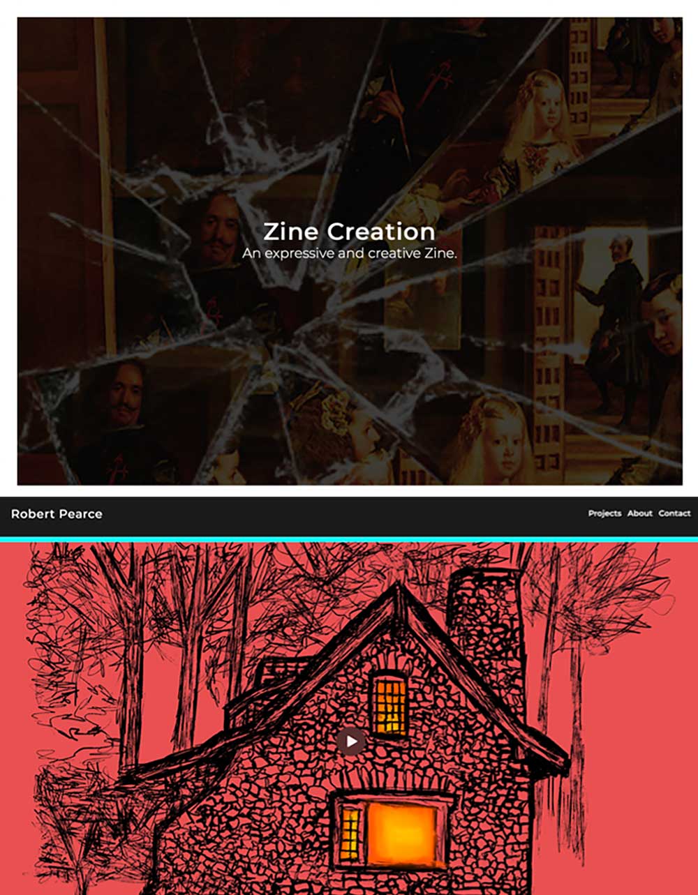
After all the development, from Navigation, Structure, Styling and then combining it all together I have the final version of the website that I am submitting as part of my Narrative, Sequence and Interaction Unit. Here I have the landing part of my Home/Projects page, as well as a close-up image of my roll over effect on my project links, which was something that took me a little while to get right, but was something I am proud to have got done. And then I also have a screenshot of the top of my motion project page.
My Reflection
After a lot of long days and learning I finally have a website that I feel has achieved the targets that this project set out for me. From day one this project looked set to be a challenge that I was not looking forward too, however I can say that it has somewhat surprised me. I had never touched coding and did not have the slightest clue what HTML and CSS even consisted of, but I can safely say now I am far more educated.